Category Archives: Articulate Storyline

The Beginning of the End

Let’s Start at the End (Of Your Course)

This week’s Articulate E-Learning Heroes challenge is to send a little love to the end of your course. It can be lonely and confusing back there – (“Is it over?” “What am I supposed to do?”) – so this week we’re sending back a life line.

The Beginning of the End

The Beginning of the End

Context & Theme

I wanted to indicate we’re starting at the very end of an interminably long course. My first choice was to start at the end of pi, but finding the end of pi is even more nebulous than the end of most courses, so that was out. (Maybe when I see Neil DeGrasse Tyson at DevLearn in October I’ll ask him if he’s made any progress on that Pi issue.)

So instead I created (the end of) a course called “Enough Already! 5,000 Little-Known Animal Facts”, which starts on the last part of the last fact about the last animal.

Indicating Completion and Next Steps

Indicating Completion and Next Steps

Spelling it Out

To be clear that you’ve reached the end of the course, I start with a congrats slide that also indicates you have a little more to do before you go.

Final Decisions

Final Decisions

Final Decisions

Which leads to an animal-themed screen where you get to make decisions.

Hover State Visual: Hovering over each picture reveals where you’ll go if you click on it.

Hover State Audio: Hovering also reveals a bit of audio. Its purpose is to add a touch of interest, amusement, and wake you up – but there have been reports of startled coworkers and kitties as of late, so consider yourself warned.

Gate Screen for Feedback

Gate Screen for Feedback

Gate Screens

After you make a selection you’ll go to a gate screen to confirm your choice.

David Anderson had a gate screen challenge a few months ago where he talked about them, and you can also see the different examples created by members of the community.

Placeholder for Feedback

Placeholder for Feedback

Room for More

In this example, if you choose anything other than “Exit” you’re taken to placeholder slides that could harbor summarizing thoughts, more resources, ideas for review, or a means of leaving feedback.

See it in Action!

Take a look at this wild little ending right here.


What Do I Think of Storyline? Well, Since You Asked…

This week’s E-Learning Heroes Challenge is to come up with a “Top 10” list of things you’d tell someone about Storyline. You can collect your favorite resource links and curate them any way you’d like.

I basically took everything that I normally say to someone who asks me about Storyline, put it all together with appropriate links, and tied a bow on it. (Not unlike last week’s challenge where I did the same for what I tell future freelancers.)

Opening Screen

Opening Screen

The Design

One advantage of the gallery layout on my blog is that I can instantly see what sort of design I should do to contrast with my recent work. Since my last two entries haven’t had vibrant color palettes, and since spring is officially here, I went for bright and springy with a little bit of silliness and a little bit of elegance.

I also didn’t want a main menu with squares or buttons that linked to the 10 points. I wanted the menu to be a creative, vibrant, graphic embodiment of the theme. Once I made that decision, the idea for the springing-up flowers came easily.

Main Menu

Main Menu

Main Menu Flowers: I wanted flower shapes that I could fill with photo captures from their related content pages. So I took out my trusty Wacom tablet and started drawing the basic outlines of the flowers, stems, and leaves. I did it in Storyline by going to Insert > Shape > Lines > Scribble and drew them right on the slide.

Then I adjusted the outline weight and color and did a picture background fill for each shape using a tight capture from each of the larger flower photos.

To make the flowers pop in their hover states, I increased the weight of the flower’s outline by a pixel or two, and increased the size of each flower by about 4 pixels in width and height.

Audio: The sound effects for the flowers are two different sounds on top of each other. One’s a pop and one’s a spring. The singing birds are a piece of audio that I looped. I knew it was possible, but had never done it before. A quick Google search took me to this simple how-to. (Thanks, David!)

Content Page #2

Content Page #2

Content Page Colors: To get colors for my text, fills, and outlines that went perfectly with the flower images, I used the heck out of the eyedropper tool.

Content Page #5

Content Page #5

Photos: They’re all from Microsoft Clipart. I wanted big, clean, bold, colorful images.

Fonts: I’ve used the title font, Blue Chucks, a couple of times lately. Same with the paragraph font Copse. When you’re a cute font, you’re gonna get used.

Content Page #9

Content Page #9

The Content

It is what it is! This is what I tell people who ask, and these are the resources I direct them to.

The Finished Product

You can see it in all of its springy loveliness right here. Enjoy!


This is Why Freelancers Need Floaties

This week’s Articulate E-Learning Heroes Challenge is to create a photo collage that tells a story.

I’ve just gotten home from a (great!) week at the E-Learning Guild’s Learning Solutions Conference in Orlando, and the theme that kept coming up was freelancing. Not just in sessions, but in countless random conversations, and I found myself offering a lot of advice to hopeful freelancers.

I Smell a Theme

So because there’s only so much space in my head and this is the topic currently on tap in there, my photo collage story this week is about a guy who wants to freelance. The points I’ve included are a summary I quickly put together for this piece, but it’s similar to what I was sharing all week.

The StoryThe Story

If I’m going to tell a story, I need a starting point. So I overlaid our (miserable) hero on top of the rest of the photo collage so that I could establish his yearning-to-go-freelance motivation. The underlying photos and their content, each of which reveals a portion of our hero’s journey, can be visited in any order. And of course you get to see the result of his efforts at the end.

Visual DesignVisual Design

I kept the visual design pretty simple. The photos are framed in a pseudo-Polaroid fashion. The caption font on the top photo is Dawning of a New Day. The title font on the pop-ups is Swiss921 BT, and the main pop-up font is Candy Round BTN Condensed.

I reused a beach and palm tree from a recent post about freelancing, mostly because I wanted the tree for the end scene.

And I reused poor Ian again. I’ve forced that poor man into service as an airline pilot and a beer-guzzling traveler in recent weeks and wanted to give him a rest, but I needed someone who could fit into the outfit at the end, and he had the perfect figure. (Sorry, guy.)

Storyline DesignStoryline Design

When clicked, each photo in the collage pops up on a slide layer with more info. Then I have each photo disappear after viewing it. That way I was able to set up a new layer of interest below. (Not unlike my approach to this menu.)

That interest includes having each photo, in miniature, drop down into the palm tree and hang there like an ornament. You can then click on those ornaments to review their content. I did this by adding a second slide layer for each collage photo.

And, of course, I had to show Ian’s transformation after he’d followed his own plan, but I could only show that after all photos had been viewed. To do this, I created a variable for each photo. After all of them have been visited, Ian and his final outfit are triggered to appear.

The ResultSee the Result!

You can see Ian in all his freelance glory here.

I’ve not had this happen before with Storyline, but I found I got very erratic results in getting Ian to show up at the end when viewing the published files. I published to Web and included HTML5 and Articulate Mobile Player on iPad output.

Ian always came in just fine when viewed on the iPad – but on Chrome, Internet Explorer, Firefox, and Safari it would sometimes work and sometimes not – even after endless rounds of cache clearing.

But I’m hopeful you’ll see Ian at the end just fine. Enjoy!

We’ll Always Have the US Passport Office

As excited as I am about packing up and heading down to this year’s Learning Solutions conference in Orlando in a few hours, I wanted to squeeze in some time to play along with this week’s E-Learning Heroes Challenge, which is all about creating interactive screenshots.

Post-Traumatic Budget Analyst Syndrome

I’m pretty sure David wanted us to focus on software for this challenge. I keenly noted this about the time I was posting my completed entry.

He’d remarked in his post how much training all of us create based on documents, charts, and software (then clearly outlined his software challenge in detail) – but “documents” apparently struck a nerve and I was suddenly having a flashback to my life as a Budget Analyst in a very large, document-heavy organization where a big part of the job was getting my peers to understand and (ostensibly) care about reams of vital-yet-soul-deadening documents and forms.

So my reeling mind started working on creative ways to present a stultifying form using the interactive screenshot approach.

US Passport Application

The Boring Document:
The US Passport Application

The Boring Document

Looking for a dull form? Who ya gonna call? Though the IRS has nothing but contenders, I chose the US Passport Application because:

1. I understand it. (Enough.)
2. I knew I could set up a quick bit of context to show when and why someone would use it.
3. I was hopeful that the context would tap into the learner’s own motivations enough to make them want to, you know – be motivated.

Midcentury Looney Tunes Design

A Midcentury Looney Tunes Design

The Style

Choosing Paris as a motivational destination was pretty easy. And after I chose the character, the background, the groovy font, and the clipart, it had become sort of a midcentury Looney Tunes kind of thing. So that worked.

Oh, and I liked the blues, but I detested the passport form’s own mustardy color. But I eventually realized it would be a lot easier to integrate it into the color scheme rather than try to mitigate it with other colors.

The Views

But mostly I wanted to focus on a design that made it easy to navigate and understand the document. So I planned three views:

The Multiple Page View

The Multiple Page View

The Multiple Page View: Treating the multiple-page form like a tabbed interaction seemed like a clean approach, so I created my own tabs on the right. It’s simple, with just two pages, but you could make the tabs much smaller and use it for a far more extensive doc, too.

I also put a “Finish” tab there so you could escape at any time, and because I wanted to show the happy aftermath of having effectively used this form, and I needed a link to get there.

The Single Page Overview

The Single Page Overview
Using a Mouse Hover

The Single Page Overview: This is on the same page as the multiple page view; it just requires hovering your mouse. I chunked the form into numbered sections. When you hover over a number, that section becomes highlighted on the right, and on the left a short explanation appears. The hover effects are simply states attached to the number icons.

Section Detail View

The Section Detail View

The Section Detail: When you click on one of the numbered sections (and this is where the interactive screenshot part of the interactive screenshot challenge comes in), you go to a detailed view of that section. I put each of these on a slide layer.

To make the details a bit more involving and helpful, I added some abbreviated instructions and a little demo of what should happen on the form using sound effects and animations.

Of course, these detailed sections could include any number of things. You could have a video showing or telling why a particular item is critical, you could link out to other resources or help, or you could come up with other ways of illustrating what you need to convey for that section.

Attaching the Document: I also thought it made sense to attach the full doc in the player. If this were a real e-learning piece, I’d certainly do that.

Success = Paris!

Success = Paris!

Success = Paris!

Or at least it does in this piece.

See it in Action

Here’s the finished piece. I hope you enjoy it, and may you always have great ideas for presenting forbidding documents of your own.

A Revealing Submenu

You’ll see this simple-but-fun submenu when I post a portfolio sample for another course – but I like it, so its getting its own post.

I created it for a subsection covering the nine parts of this organization’s code of conduct. I wanted it to be attractive, responsive, kind of fun, meaningful to the organization, and track which sections had already been visited, while still making each one easy to revisit.

The Idea

I thought it would be fun to have it look a bit like a game board. As the learner clicks on each section, it reveals part of a photo.  Once the photo is fully revealed, you’ve finished that section. I had lots of photos to choose from, but narrowed it down by looking for one that:

  • I could make square to fit the tic-tac-toe/Brady Bunch layout I had in mind,
  • Included people from the same general part of the world that learners would be from,
  • Would show people involved in an organization-related activity, but I didn’t want to reveal what they were doing until the learner had visited almost all nine sections of the code.

The Pieces and Parts

The Grid: I used the bright course color palette to create the nine boxes. Since the organization refers to their Code sections by number, it was appropriate to label them with each section’s number, as opposed to a description or image. Looks more like a game that way, too.

The Basic Grid Design

The Basic Grid Design

The Side Reveal: So learners could see the name of each Code section before visiting it, I added a trigger to each square in the grid. When you hover over each one, a slide layer shows the section name on the right side.

Side Reveal on Right With Mouse Hovering Over Grid Section #5

Side Reveal on Right With Mouse Hovering Over Grid Section #5

The Photo Reveal: The photo is on the slide master. I created each square as an inserted object on the slide, then keyed the text directly into it. When the learner clicks, the visited state is revealed. The only difference between the normal and the visited state is that I removed the fill color for the square. I still wanted the number to be visible after the square was visited so that it would be easy to go back and revisit the section, and I liked the different-colored outlines that remained after the fill color was gone.

Clicking Reveals a New Piece of the Photo

Clicking Reveals a New Piece of the Photo

See it in Action

This is just a demo of the menu, of course. The section header slides it branches to in the real course take you off into scenarios and all kinds of fun stuff. But you can see the menu sample here.

Thank You, Tim!

By the way, in this sample you’ll briefly see the section header slides I used in the course. These slides are heavily based on Tim Slade’s lovely – and free! – template that he so kindly shared on his site.  Tim’s a gifted and generous designer and you should check out the rest of his site while you’re busy getting the template. (Thanks, Tim!)

Section Header Slide Based on Tim Slade's Design

Section Header Slide Based on Tim Slade’s Design

At Last! A Drinking Game I Can Win

At Last! A Drinking Game I Can Win

For this week’s Articulate E-Learning Heroes Challenge, David Anderson dared us to create a simple game. (Oh, it’s on.) I created an Oktoberfest Quest game, wherein our hero drinks his way across Germany in order to reach the hallowed beer tents of Oktoberfest in Munich. Somebody had to do it.

A Triumvirate of Inspiration

Maßkrug
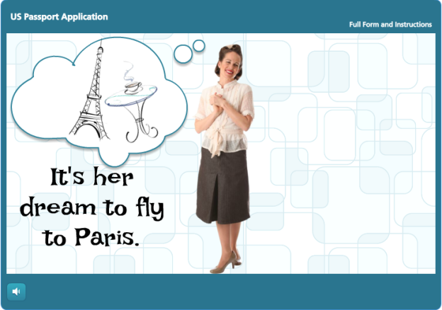
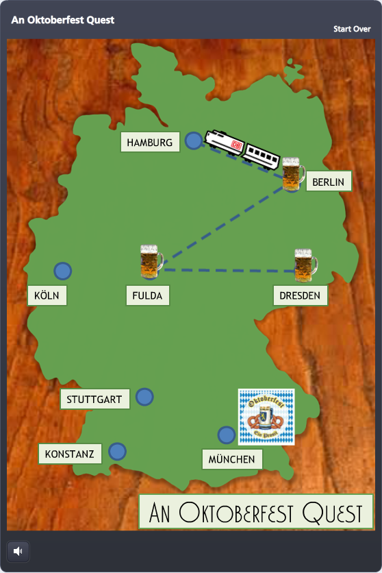
Timing: David put out the challenge only hours after I’d participated in the weekly #lrnchat discussion on Twitter. Everyone was terribly serious as they discussed how to work collaboratively in groups – until someone brought up beer as a motivational tool. Well, THAT got them dancing in the Twittery aisles, and the whole evening changed. I don’t drink much, but I made a large mental note of what got them engaged: The mere mention of beer.

Topic: As they say, go with what you know. After collecting entirely too many degrees in German, teaching German, and studying, working, and living in Germany – I thought to myself: “maaaaaybe something German…?”

Potential Game Features: I wanted to focus on designing a game board and some sort of progress meter. Since a map of Germany seemed like a natural game board, and a giant Maßkrug slowly filling with beer seemed like an outstanding progress meter, I decided to try those.

Design

Since my primary elements, the map of Germany and the Maßkrug, were better suited to a portrait orientation, I flipped the standard Storyline layout so they could inhabit the full screen.

Once I decided to use the game to teach German dining customs, I put a wooden background underneath the map to evoke the feel of a restaurant table, and the checkered tablecloth behind the Maßkrug for the same reason.

I also knew that sound effects would be critical, especially for filling the Maßkrug. I got lucky and found some evocative ones.


Oktoberfest Quest Game Board

Game Progress

There are two measures of progress: linear progress on the map, and liquidy beer progress in the Maßkrug.

Linear Progress: I thought a little Krug at each completed stop on the map would be a good tracker, and moving by train would make it feel like you’re making game progress, and also evoke the sense of traveling through Germany.

At each stop I used a zoom region to zoom in tightly on the city, and then an immediate “Box Out” transition on the following question slide so that, together, it would feel a bit like you’re zooming from the macro map to the micro restaurant where our protagonist needs some help. 

Krug-O-MeterBeer Progress: Every time you answer a question correctly, the Maßkrug fills up a little more. By also using it to briefly recap the teaching point, it doubles as a bit of learning reinforcement.

And speaking of learning stuff, I chose to make it an all-or-nothing game. You’re required to answer each question correctly in order to go forward. One wrong answer and you’re back in Dresden waiting for the train.

I credit Michael Allen with this torture. I saw a banking example of his where you decide whether or not to approve a series of checks for payment. One wrong decision, and you’re back to check one. It ticks you off just enough that you get determined to beat the stupid thing, and while you’re at it, you learn the principles being taught.

The Big Finish

I won’t spoil it for you, but it’s kind of awesome.

Play It!

My Oktoberfest Quest game is here, but you should also check out the other creative, amazing, and beautiful game ideas posted by others in the comments section of David’s original post here.

Please Don't Let Me Be Martha Stewart

Please Don’t Let Me Be Martha Stewart

With one eye on project deadlines and flights this week, I trained the other on goofing off with Articulate’s E-Learning Heroes challenge to bring the Inc.com What Kind of Leader Are You? infographic to life by interpreting it as a branching scenario.

What kind of leader are you?Infographic

Approach

Since this is a personality assessment that briefly flirts with a teaching moment, I chose not to set up full-blown scenarios with characters to put each decision point in context. It would be fun; but it would also seem kind of silly to spend all that time illustrating such abstract concepts when the only world that matters here is the user’s internal one.

I decided the cleanest and most expeditious way to bring some life and abbreviated context to this interaction was through good use of color, text, animation, and simple images.

Color

Since the world is flat these days, I snagged some flat design colors from one of Damon Nofar’s SlideShare presentations.

I like to relaaaaaaax by...Where are you most likely to interact with employees?Backwards DirectionForwards DirectionText & Animation

I suppose Damon decided he could inspire me with text, too, which must be why he posted this presentation. (And I now see he posted another one about using typography a few hours ago where he lays out a number of principles I used in my piece – but I hadn’t seen that one.)

In the end, Swiss921 BT made me happy, so that’s my title font. I threw in some Helvetica in honor of Damon’s devotion to it; though I’m more of a Calibri fan. (So there’s some of that, too.)

I decided that pulling key words and making them stand out would be the easiest way to let the user quickly scan the decision point.

I also messed with the keywords so they’re more expressive – whether changing the word itself (using lots of extra “a”s in “relax”), changing the type layout (so “interact’s” letters get all inter-mingly), and so on. I also used animation. My favorite is when the word “direction” comes in backwards, then quickly realizes its mistake and comes in forwards. But that’s just me.

Simple Images

I originally envisioned hand-drawn white line drawings to soften and balance the strong font I’d chosen, and gave Microsoft clipart a quick search.

I started by looking for a mountain image to illustrate the idea of a challenge. When I found one in Microsoft Clipart Style #1306, and took a quick look to see if the rest of the style could work, I had my images.

I wanted to take out, or at least adjust, the colors, but given time constraints I just made a few alterations to specific images (like the clouds that float across the sky at the beginning) and left it at that.

Rudy GiulianiDevices & Navigation

This piece seemed to want to be a little app, so I had the iPad in mind as I designed it. Works just fine.

I kept navigation simple, since it’s really just a one-way path. I added a “Start Over” link in the player so the path could be restarted as many times as desired – so if you don’t want to be Rudy Giuliani, or even Martha Stewart, you have an “out”.

Audio

I would love to put in audio (sound effects, etc.), but no time. Maybe I’ll add some soon.

See the Result!

You can see this little guy (and find out what kind of leader you are) here.

What if I Just Dreamed I Made a Great Template?

That darned David Anderson and his e-learning challenges. Why am I hooked on these?

This week, as a good citizen of the world, he put forth the challenge to build an e-learning template themed for the 2014 Winter Olympics in Sochi. Since sports-related design is waaaaaaay outside of my comfort zone, it was irresistible. I grabbed my design skis and headed for the nearest Black Diamond drawing board. Here are the 5 template slides he wanted:

Cover Slide

Title: I knew I could slap in a lot of images from the official site, but I wanted it to be inspired by them rather than looking like a dead-on copy. So I took the official logo, seen below, and made my own cover slide based on that – finding a similar font and replacing the Olympic rings with a logo placeholder.Cover SlideSochi Logo

Background: I then found a nice, frigid landscape for the background and ended up using that throughout the template.

Sound Effects: I knew that having the design elements come schussing in to skiing sounds would be an obvious choice, but I did it anyway. For some reason I really wanted the cry of an unseen, anguished skier at the end of this slide. I put it in to entertain myself, not knowing whether I’d find a reason to keep it, and moved on.

What to Design Next?

My inclination was to design the objectives slide next, but I wanted to present them in context and at a point of need. Unless I care about why I’m going somewhere in a course, I’m not inspired to design it – much less subject learners to it. I thought Tom Kuhlman did a great job of illustrating the idea in this post about making objectives interesting. His demo of the emergency-preparedness kit objectives being presented in an involving way was along the lines of what I wanted.

So I knew the scenario had to come next.

Scenario Slide

Since I had already established that our as-yet-unseen protagonist had been skiing in a generic frozen landscape and that something alarming had happened, I decided he was lost and had skied his way to the games by accident, and that he had no idea where he was.

So he needed to figure out where he was and what was going on. I gave him the option of asking a guy with a gun (who could be a biathlon participant – or not), or visiting some random computer kiosk nearby.Scenario Slide 1Scenario Slide 2

So the scenario establishes the context (I’m lost on a frozen mountain), which gives him the motivation to take action.

Once we get him to the “Need Help?” button on the kiosk screen, he’s on his way.

Objectives Slide

NOW I was ready for the objectives. I used the title font and Olympic ring colors and had each objective come schussing in over the mountainous background.

Hovering over each one reveals its general content, and clicking takes you there. I like to express objectives as questions, since they’re more involving, so that was the general scheme.

Objectives Slide

Figuring our protagonist might like a map and the general lay of the land, I had the “where is…” section point to some Olympic park venue content for him.

Interaction Slide

In the interest of keeping this simple, I used an interactive map that starts with an overview of the area. You can choose to see more detail for a particular section, and from that detail you have the option of pulling up a PDF to see the extreme detail and lots more information.Interaction Slide

Of course you could also present interactive content here using video, games, tabs, links, or whatever you’d like.

I used variables so that the button that allows you to continue doesn’t show up until both map sections have been visited. Because I could.

Quiz Slide

Which brings us to the big payoff. What have we learned on this mountain today?

It occurred to me that my “correct” answer could explain how this guy ended up here – and offer him some medical help as his reward – so that’s what I did. Who doesn’t like a story with a happy ending?

Quiz Slide

Have a Look!

If you’d like to see this baby in action, it’s right here. 

Dragging & Dropping Your Seat Mate

I enjoy a good drag-and-drop interaction, clients love them, and they do perk things up – but I only occasionally use them.

So when Articulate’s David Anderson published this week’s E-Learning Challenge to create a custom non-quiz drag-and-drop interaction, it inspired me to try one for fun. I don’t know if my example is exactly what David had in mind (I tried!), but it’s what I was inspired to create.

The Idea

I immediately thought of airplane travel and that moment you’re in your seat watching others come down the aisle towards you as you think “Is that the person I’ll be spending the next 12 hours with, or maybe that one?” Which led me to a drag-and-drop interaction where you get to choose your seat companion based on that same lack of information, and then suffer (or enjoy) the consequences.

The interaction could easily be adapted to a real course – maybe as a predictive exercise. You could have learners choose people to perform a particular job based on whether or not they look like they have the right safety gear on, for example – then see what happens!

You're getting on a plane!

Choose Your Seat Mate

Building It

I built it in Storyline, but didn’t use its built-in drag-and-drop options. I just created custom triggers and used ancillary slides to show the results of each choice.

Interestingly, my biggest sticking point in construction was getting any of it to function properly as long as my drop target wasn’t visible. (You drop fellow passengers into the airplane seat next to you, but in order to isolate that drop area I used an invisible shape on top of the seat image.)

It was only after I had the vaguest recollection of seeing a video from Jeanette Brooks where she made her drop target invisible by making the fill color transparent, as opposed to choosing no fill color, that I got the thing to work. Silly me.

Enjoying The Consequences

I can’t help it. I just like this one. You can see it here.

He Kicked Your Behind at Trivia She Kept Running Her Lines He Kept Blurting Out Movie Spoilers She Just Snored on Your Shoulder He Loved Your Script! Thank you!

No One Loves The “Next” Button Until It’s Gone

No One Loves The “Next” Button Until It’s Gone

I haven’t participated in many of the weekly design challenges that David Anderson puts out to the Articulate community, usually because of a looming project deadline. But if so many other busy designers are doing it, what’s my deal?

So this week, casting all current deadlines to the wind, I took up David’s gauntlet and spent my Friday night Storylining away.

This week’s challenge is based on his blog post about hiding the “next” button until the learner completes a challenge about what’s just been presented. (Or it can be used as a sort of pre-test to unlock the “next” button and allow the learner to skip ahead.)

From an instructional design perspective it would have to be used incredibly judiciously; though if sprinkled in a few key places in just the right course, it could be effective. But this challenge was about the technical aspects of building it, so that’s what I focused on.

My Example

I chose the HR Audit topic because it seemed appropriately dry. I’m picturing a nodding-off learner who’s about to get a disappearing-“next”-button wake-up call.

Appropriately Dry Topic

Appropriately Dry Content

Question Posed

Feedback for Incorrect Answer

Enabled "Next" Button for Correct Answer

Glorious Reward

Basically, at the end of the slide you ask the learner a question about what they just saw.

Here, I ask them to enter a certain number they just saw. The “next” button is visible but disabled.

If their answer is incorrect, they get a message asking them to try again, or to review the slide content.

Once they get it right, the “next” button is enabled and they go on to their glorious reward in the final slide.

The Tech Side

David wanted a text-based entry field for the learner to complete in order to unlock the “next” button, so in Storyline that means adding a data entry field. I’d never had a reason to use them before, so I used a post on the E-Learning Heroes site from Jeanette Brooks that explained how to set them upIt would help to have some experience with variables, but it’s probably not necessary for the average intrepid Storyline user.

After that it was all about the layers and states and triggers. I won’t get into extreme detail, but on the main slide I added a trigger so that at the end of the timeline it would show a layer. At the end of the timeline I also animated out any potential answers on the slide so they weren’t visible.

On the layer I put the question, the data entry field, the “next” button (set to an initial state of “disabled”), a line of text feedback if the answer is incorrect (set to an initial state of “invisible”), and a “review” button so they could see the slide content again if the answer is incorrect (also set to an initial state of “invisible”.)

Then I just got all trigger-happy until it behaved properly.

Here’s my published version.

Does Nepal like Submit buttons?

Woman and ChildI’m redesigning an e-learning course I did for an international nonprofit’s US audience so it can be deployed to their offices in Asia and Africa, and I’m excited about it. I love this stuff!

Here are some of the adaptations I’ll make:

Simplifying Language
As someone who’s worked and studied in countries where I was a non-native speaker, I know it’s tough to get things done if you’re distracted by words and phrases you don’t know or can’t quite catch.

This adaptation isn’t too hard. The audience speaks English, but they are non-native speakers. Language simplification will involve cutting out slang, simplifying sentence structure, and using simpler words when possible – and keeping voiceovers crystal clear, of course.

Amplifying Context
Since a huge part of language comprehension relies on context, I’ll make sure there’s little doubt about what’s going on at any given time. My designs are already driven by characters and situations that I present in a clear visual style.

I’ll present scenarios as I usually do and add additional visual and language cues to quickly and easily convey meaning. The bottom line is that I expect to add more slides (and/or layers or states, for you Articulate Storyline fans) so that less is left to the imagination.

Staying Culturally Aware
I’m double checking with my client about all kinds of choices I don’t normally need to ask about: Character names, hand gestures, clothing choices, etc., and my guess is that after testing it in the field they’ll come up with other tweaks we haven’t thought of yet. (I’m excited to learn what they’ll be!)

Learning & Using Articulate Storyline: So Far So Happy

Happy_developer_3cr_50

I have a good excuse for not posting since discovering Articulate Storyline: I’ve been busy producing courses with it. I knew when I first tried it last March that it had great potential. After having used it consistently for the last six months, I can report that it has delivered beautifully.

Here’s my experience learning and using it so far: I learned it (keeping in mind that I was already fluent in the Articulate Suite programs) by:

  1. Taking a one-day workshop at the E-Learning Guild’s Learning Solutions conference in Orlando last March, and Ron Price from Yukon Learning was an outstanding instructor.
  2. Buying and referring to Diane Elkins and Desiree Pinder’s book E-Learning Uncovered: Articulate Storyline.
  3. Referring to, as needed, Articulate’s extraordinarily helpful blogs and tutorials: http://community.articulate.com/tutorials/products/articulate-storyline.aspx.

My user experiences so far:

  • Software-wise it’s stable, quick, and a pleasure to work with. (Quizmaker can only dream of stability like this.)
  • Instruction-wise it lets me easily design courses and interactions that are creative, engaging, and effective.
  • Development-wise it lets me build those courses quickly and easily. My first course took longer to build than those I’ve done since, of course, but once you’ve got your first course figured out, you’re on your way.
  • Client-wise, my clients are thrilled with the variety of features and interactions I can now include, and they’ve never had issues delivering the courses to their learners via LMS.

So that’s what I’ve been up to. How about you?