Tag Archives: Typography

My Sketchy Life as an E-Learning Designer

Since so many people are sketchy about what we do as e-learning designers, it seems appropriate to answer this week’s Articulate challenge in a similar vein.

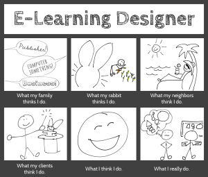
This week’s challenge is to answer the question “What do e-learning designers really do?” using the architecture of a visual meme supplied by David Anderson.

Design

My Sketchy Life as an E-Learning Designer

Click for Larger Image

I considered doing something interactive in Storyline, but went for a simple image instead. I’ve been playing with sketches lately and it seemed like a good sketching exercise. I created the finished image in PowerPoint.

Sketches: I made these on an iPad with an app called Pencilicious and a generic cell phone stylus. It would have been hugely easier with a stylus that wasn’t shaped like a big fat pencil eraser, but they don’t call this a “challenge” for nothing.

My process to go from scribbling to having usable PNG files: Sketch on iPad > email to self as PDF > export images as PNGs > use ’em! I was impressed with Pencilicious. It was the simple, easy-to-use app I was hoping for at only $2.99, and I’m looking forward to using it more.

Colors: I tamed the all-black frame of David’s example to more of a graphite color to work with the pencil-like theme. The only other colors are in the carrot garden, and that was because I didn’t think my carrots would look like carrots without color. I tried balancing that color with color elsewhere, but didn’t like it. So it’s an unbalanced design in favor of my bunny’s carrots.

Fonts: I’ve been in love with the header font, Cabin Sketch, since we first met. I’ve not had a chance to use it until now, so color me happy. The caption font is Cabin (brother of Cabin Sketch), and the three fonts in the first frame are Cedarville Cursive, Chocolate Windows, and Sneakerhead BTN Shadow.

Content

What my family thinks I do. This is dead accurate. My sister-in-law just sent me a job post, happily noting that it sounds “just like you!” It was for a publishing job. My brother suspects I do something with computers, and my lovely mother excitedly tells everyone she can that I’m an extraordinary businesswoman. (She’s sweet like that.)
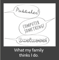
What my family thinks I do.

What my rabbit thinks I do. All she knows is that I come up with endless feasts of carrots and kale, and she knows you get carrots by digging them up, so she probably thinks this is what I’m up to all day.

What my neighbors think I do. There’s no way they’d even have a guess. Best case, they think I spend all my time goofing off between vacations.
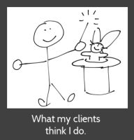
What my clients think I do.What my clients think I do. I adore them because they think I make magic happen.

What I think I do. I love what I do as an e-learning designer (don’t tell anyone), and between that and getting to work for myself from home, it’s hard not to be happy.

What I really do. I do what we all do: I work with clients; take in a gazillion project details; organize, analyze, and process them; dream up attractive, effective, and fun training solutions; and build them. (In a computer! So my brother was right.)

Hope you like it!

You Can't Escape Good Design

You Can’t Escape Good Design

I started this week’s Articulate E-Learning Heroes Challenge by creating this poster, based on a design quote I like. But it’s a general design concept not specific to instructional design, so I thought I’d try for something that feels a little more on-the-nose.

Poster Challenge ReduxA Bull in an Instructional Design Shop

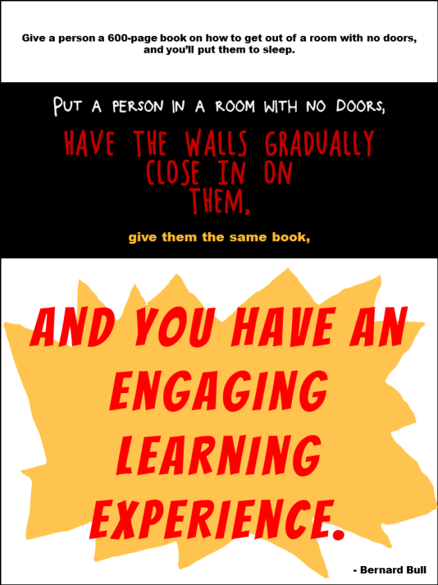
I found a quote from Bernard Bull that resonated with me, and created the illustrative poster you see here.

The Truth

The funny thing is, throughout this challenge I’ve kept thinking “I don’t refer to quotes; I refer to Michael Allen’s Context, Challenge, Activity, Feedback (CCAF) design model.” It’s not an inspirational quote, but it’s what’s always on my desk and it inspires me every time I design.

Funnily enough, it was only after I’d completed the poster that I realized that this quote is a good example of the CCAF model in action:

The Context: You’re imprisoned and the walls are closing in.
The Challenge: Get out.
The Activity: Use that book I gave you to figure out how.
The Feedback: Either you set yourself free or you subject yourself to the standard walls-closing-in conclusion.

So I was kind of happy about that.

Poster Design

Section 1: Boredom; Lack of Engagement. Clearly I made this as dull as I could. Small black type on a white background to evoke the feel of most 600-page books. The font is Arial Black.

Section 2: The Nefarious Context. Pretty self-explanatory colors and layout. The fonts are Block It Out, Chocolate Windows, and Arial Black.

Section 3: The Big Bang of Engagement. I hand-drew the splashy yellow thing in the background, and the font is, appropriately, Bangers.

The Attribution: Mr. Bull is wearing Arial Black.

Again, I just created it quickly in PowerPoint; though the fuzziness of the Arial Black bugs me. If I can’t take it anymore I’ll put it into Fireworks and convert the text to paths so it’s clearer.

You Can Quote Me

You Can Quote Me

After running us ragged lately, Articulate’s David Anderson gave us a design challenge that was a relative walk in the park this week. His humble request was to take a favorite instructional design quote and create a poster making good use of typography to express it.

all_problemsThe Quote

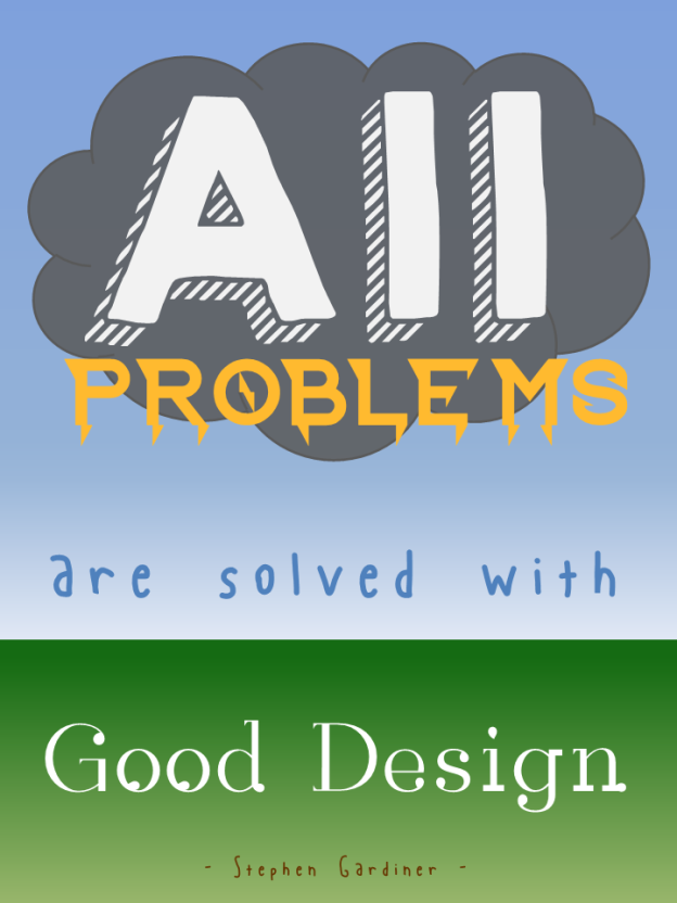
Since I believe that design (instructional and otherwise) rules all (and that solving design problems is the biggest kick there is), I chose architect Stephen Gardiner’s quote “All problems are solved with good design.”

The Idea

I tried to think of a visual expression of “all problems” that could somehow resolve itself in “good design” and, as you can see, pretty quickly came up with a storm-cloud-laden sky giving way to raindrops and then to the new growth of earth below.

To keep it quick and easy, I mocked it up in PowerPoint. Since I needed vertical sky-to-ground space, I changed the layout to portrait orientation by going to Design > Slide Orientation > Portrait.

Typography

Fonts: I found all fonts on dafont.com.

“All”: After trying out a good number of cloud-like fonts, I wasn’t happy. Once I placed a basic cloud shape and tried out fonts on top of it, I got happy with, appropriately enough, KG HAPPY. Something about the shadow made me think of storm clouds and rain.

“Problems”: This had to look like lightning, and I got lucky with Ride the Lightning. It was clean enough and bold enough to work, and it gave the visual sense of lightning bolts coming down from the clouds that I wanted.

“Are Solved With”: I wanted these words to have the feel of raindrops, but literal raindrop fonts were just too much. This is Blue Chucks, which the designer says was “inspired by my wonderful shoes”. (Well done, Sir.) I like that his baseline and topline are uneven and it looks sort of loose, like rain. I tried messing with it by puttting each letter into its own text box so that I could make it even more uneven and rain-like, but I wasn’t crazy about that. I was happier letting this nice font be true to itself.

“Good Design”: This one worried me a bit. I wanted it to look like new growth coming from the earth, but the plant-like fonts I found weren’t clean enough. I liked this one because I thought it was suggestive of buds starting to come out of a plant; though oddly enough it’s called Rain.

The Attribution: Well, hopefully Mr. Gardiner would have had a sense of humor about this, because I wanted the font to look like worms deep in the ground helping to start new life. I went with Blue Chucks again for the same wriggly, uneven, yet clean feel. And, of course, using the same font again gives a little more unity to this font-heavy design.

Background

I went with simple blue and green gradients. For the sky, I liked that it looked more like a storm to have the sky darker near the clouds and lighter near the ground, and I thought the green gradient made the ground look a little more alive – worms and all.

The Result

Here it is, full-size.

Please Don't Let Me Be Martha Stewart

Please Don’t Let Me Be Martha Stewart

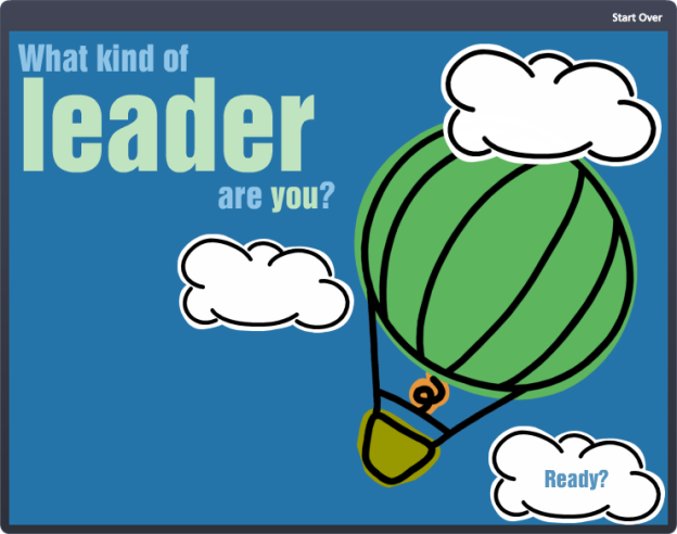
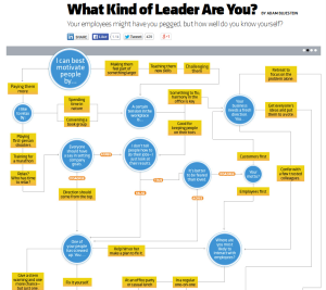
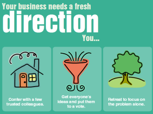
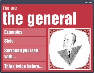
With one eye on project deadlines and flights this week, I trained the other on goofing off with Articulate’s E-Learning Heroes challenge to bring the Inc.com What Kind of Leader Are You? infographic to life by interpreting it as a branching scenario.

What kind of leader are you?Infographic

Approach

Since this is a personality assessment that briefly flirts with a teaching moment, I chose not to set up full-blown scenarios with characters to put each decision point in context. It would be fun; but it would also seem kind of silly to spend all that time illustrating such abstract concepts when the only world that matters here is the user’s internal one.

I decided the cleanest and most expeditious way to bring some life and abbreviated context to this interaction was through good use of color, text, animation, and simple images.

Color

Since the world is flat these days, I snagged some flat design colors from one of Damon Nofar’s SlideShare presentations.

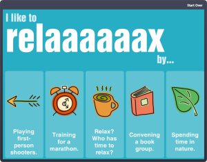
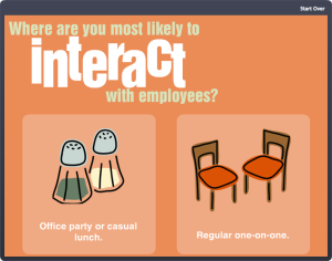
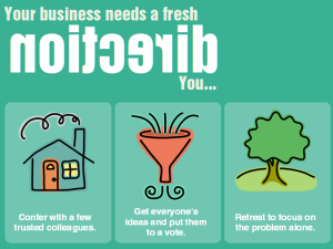
I like to relaaaaaaax by...Where are you most likely to interact with employees?Backwards DirectionForwards DirectionText & Animation

I suppose Damon decided he could inspire me with text, too, which must be why he posted this presentation. (And I now see he posted another one about using typography a few hours ago where he lays out a number of principles I used in my piece – but I hadn’t seen that one.)

In the end, Swiss921 BT made me happy, so that’s my title font. I threw in some Helvetica in honor of Damon’s devotion to it; though I’m more of a Calibri fan. (So there’s some of that, too.)

I decided that pulling key words and making them stand out would be the easiest way to let the user quickly scan the decision point.

I also messed with the keywords so they’re more expressive – whether changing the word itself (using lots of extra “a”s in “relax”), changing the type layout (so “interact’s” letters get all inter-mingly), and so on. I also used animation. My favorite is when the word “direction” comes in backwards, then quickly realizes its mistake and comes in forwards. But that’s just me.

Simple Images

I originally envisioned hand-drawn white line drawings to soften and balance the strong font I’d chosen, and gave Microsoft clipart a quick search.

I started by looking for a mountain image to illustrate the idea of a challenge. When I found one in Microsoft Clipart Style #1306, and took a quick look to see if the rest of the style could work, I had my images.

I wanted to take out, or at least adjust, the colors, but given time constraints I just made a few alterations to specific images (like the clouds that float across the sky at the beginning) and left it at that.

Rudy GiulianiDevices & Navigation

This piece seemed to want to be a little app, so I had the iPad in mind as I designed it. Works just fine.

I kept navigation simple, since it’s really just a one-way path. I added a “Start Over” link in the player so the path could be restarted as many times as desired – so if you don’t want to be Rudy Giuliani, or even Martha Stewart, you have an “out”.

Audio

I would love to put in audio (sound effects, etc.), but no time. Maybe I’ll add some soon.

See the Result!

You can see this little guy (and find out what kind of leader you are) here.