You’ll see this simple-but-fun submenu when I post a portfolio sample for another course – but I like it, so its getting its own post.
I created it for a subsection covering the nine parts of this organization’s code of conduct. I wanted it to be attractive, responsive, kind of fun, meaningful to the organization, and track which sections had already been visited, while still making each one easy to revisit.
The Idea
I thought it would be fun to have it look a bit like a game board. As the learner clicks on each section, it reveals part of a photo. Once the photo is fully revealed, you’ve finished that section. I had lots of photos to choose from, but narrowed it down by looking for one that:
- I could make square to fit the tic-tac-toe/Brady Bunch layout I had in mind,
- Included people from the same general part of the world that learners would be from,
- Would show people involved in an organization-related activity, but I didn’t want to reveal what they were doing until the learner had visited almost all nine sections of the code.
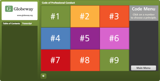
The Pieces and Parts
The Grid: I used the bright course color palette to create the nine boxes. Since the organization refers to their Code sections by number, it was appropriate to label them with each section’s number, as opposed to a description or image. Looks more like a game that way, too.

The Basic Grid Design
The Side Reveal: So learners could see the name of each Code section before visiting it, I added a trigger to each square in the grid. When you hover over each one, a slide layer shows the section name on the right side.

Side Reveal on Right With Mouse Hovering Over Grid Section #5
The Photo Reveal: The photo is on the slide master. I created each square as an inserted object on the slide, then keyed the text directly into it. When the learner clicks, the visited state is revealed. The only difference between the normal and the visited state is that I removed the fill color for the square. I still wanted the number to be visible after the square was visited so that it would be easy to go back and revisit the section, and I liked the different-colored outlines that remained after the fill color was gone.

Clicking Reveals a New Piece of the Photo
See it in Action
This is just a demo of the menu, of course. The section header slides it branches to in the real course take you off into scenarios and all kinds of fun stuff. But you can see the menu sample here.
Thank You, Tim!
By the way, in this sample you’ll briefly see the section header slides I used in the course. These slides are heavily based on Tim Slade’s lovely – and free! – template that he so kindly shared on his site. Tim’s a gifted and generous designer and you should check out the rest of his site while you’re busy getting the template. (Thanks, Tim!)

Section Header Slide Based on Tim Slade’s Design

 I’m redesigning an e-learning course I did for an international nonprofit’s US audience so it can be deployed to their offices in Asia and Africa, and I’m excited about it. I love this stuff!