Tag Archives: Quotes

You Can't Escape Good Design

You Can’t Escape Good Design

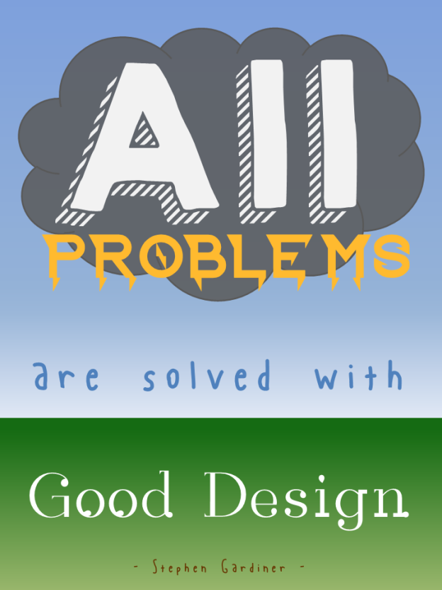
I started this week’s Articulate E-Learning Heroes Challenge by creating this poster, based on a design quote I like. But it’s a general design concept not specific to instructional design, so I thought I’d try for something that feels a little more on-the-nose.

Poster Challenge ReduxA Bull in an Instructional Design Shop

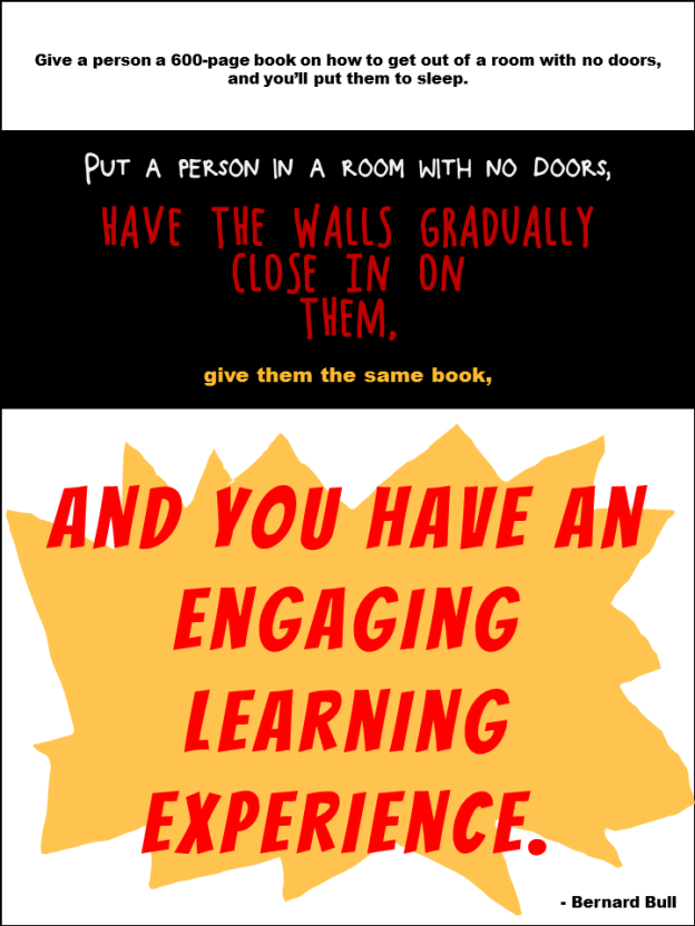
I found a quote from Bernard Bull that resonated with me, and created the illustrative poster you see here.

The Truth

The funny thing is, throughout this challenge I’ve kept thinking “I don’t refer to quotes; I refer to Michael Allen’s Context, Challenge, Activity, Feedback (CCAF) design model.” It’s not an inspirational quote, but it’s what’s always on my desk and it inspires me every time I design.

Funnily enough, it was only after I’d completed the poster that I realized that this quote is a good example of the CCAF model in action:

The Context: You’re imprisoned and the walls are closing in.
The Challenge: Get out.
The Activity: Use that book I gave you to figure out how.
The Feedback: Either you set yourself free or you subject yourself to the standard walls-closing-in conclusion.

So I was kind of happy about that.

Poster Design

Section 1: Boredom; Lack of Engagement. Clearly I made this as dull as I could. Small black type on a white background to evoke the feel of most 600-page books. The font is Arial Black.

Section 2: The Nefarious Context. Pretty self-explanatory colors and layout. The fonts are Block It Out, Chocolate Windows, and Arial Black.

Section 3: The Big Bang of Engagement. I hand-drew the splashy yellow thing in the background, and the font is, appropriately, Bangers.

The Attribution: Mr. Bull is wearing Arial Black.

Again, I just created it quickly in PowerPoint; though the fuzziness of the Arial Black bugs me. If I can’t take it anymore I’ll put it into Fireworks and convert the text to paths so it’s clearer.

You Can Quote Me

You Can Quote Me

After running us ragged lately, Articulate’s David Anderson gave us a design challenge that was a relative walk in the park this week. His humble request was to take a favorite instructional design quote and create a poster making good use of typography to express it.

all_problemsThe Quote

Since I believe that design (instructional and otherwise) rules all (and that solving design problems is the biggest kick there is), I chose architect Stephen Gardiner’s quote “All problems are solved with good design.”

The Idea

I tried to think of a visual expression of “all problems” that could somehow resolve itself in “good design” and, as you can see, pretty quickly came up with a storm-cloud-laden sky giving way to raindrops and then to the new growth of earth below.

To keep it quick and easy, I mocked it up in PowerPoint. Since I needed vertical sky-to-ground space, I changed the layout to portrait orientation by going to Design > Slide Orientation > Portrait.

Typography

Fonts: I found all fonts on dafont.com.

“All”: After trying out a good number of cloud-like fonts, I wasn’t happy. Once I placed a basic cloud shape and tried out fonts on top of it, I got happy with, appropriately enough, KG HAPPY. Something about the shadow made me think of storm clouds and rain.

“Problems”: This had to look like lightning, and I got lucky with Ride the Lightning. It was clean enough and bold enough to work, and it gave the visual sense of lightning bolts coming down from the clouds that I wanted.

“Are Solved With”: I wanted these words to have the feel of raindrops, but literal raindrop fonts were just too much. This is Blue Chucks, which the designer says was “inspired by my wonderful shoes”. (Well done, Sir.) I like that his baseline and topline are uneven and it looks sort of loose, like rain. I tried messing with it by puttting each letter into its own text box so that I could make it even more uneven and rain-like, but I wasn’t crazy about that. I was happier letting this nice font be true to itself.

“Good Design”: This one worried me a bit. I wanted it to look like new growth coming from the earth, but the plant-like fonts I found weren’t clean enough. I liked this one because I thought it was suggestive of buds starting to come out of a plant; though oddly enough it’s called Rain.

The Attribution: Well, hopefully Mr. Gardiner would have had a sense of humor about this, because I wanted the font to look like worms deep in the ground helping to start new life. I went with Blue Chucks again for the same wriggly, uneven, yet clean feel. And, of course, using the same font again gives a little more unity to this font-heavy design.

Background

I went with simple blue and green gradients. For the sky, I liked that it looked more like a storm to have the sky darker near the clouds and lighter near the ground, and I thought the green gradient made the ground look a little more alive – worms and all.

The Result

Here it is, full-size.